Bootcamp / Session 5 / 5.1

Session 5.1 · Lecture

A brief introduction to single-cell RNA-seq analysis

Manuel Garber walks through what a single-cell experiment measures and the standard path from cells to answers: quality control, variable genes, dimensionality reduction, clustering, naming cell types, and then the two questions most studies ask, whether cell-type proportions change and whether expression changes within a cell type.

Slides Manuel Garber · lecture · ten teaching figures

Recording

Manuel’s lecture: a brief introduction to single-cell RNA-seq analysis.

Manuel Garber · 30 minutes · Slides below

Slides

What the lecture covers

  1. Where the data come from. Most single-cell data come from a microfluidic device that captures one cell per droplet and barcodes its transcripts.
  2. QC. Filter out empty droplets, dying cells and doublets before anything else.
  3. The goal. Identify cell types, to annotate a tissue, to find changes in their proportions across samples and conditions, to find state changes along a continuous trajectory, to find regulatory programs, or to build an atlas.
  4. Variable genes and dimensionality reduction. Choose the informative genes carefully, then compress them to a few dozen dimensions.
  5. Clustering. Group cells by transcriptional similarity, usually with graph-based clustering (Leiden or Louvain).
  6. Naming clusters. Three routes: strict differential expression of marker genes, biological intuition (ask your friend), and label transfer from another dataset or a foundation model.
  7. Proportion analysis. Did a cell type become more or less common?
  8. Differential expression, an unsolved problem. Option 1 goes back to bulk RNA-seq by pseudobulking: conservative and well calibrated, but it needs thresholds, enough cells per sample, and more samples. Option 2 treats every cell as a replicate: more power and fewer ad hoc decisions, but always unbalanced, sparse, and prone to false positives.

The analysis in ten figures

Each figure pairs a step of the analysis with the kind of plot it produces. All data in them are simulated. They illustrate the methods; they do not report biological findings or run the named packages.
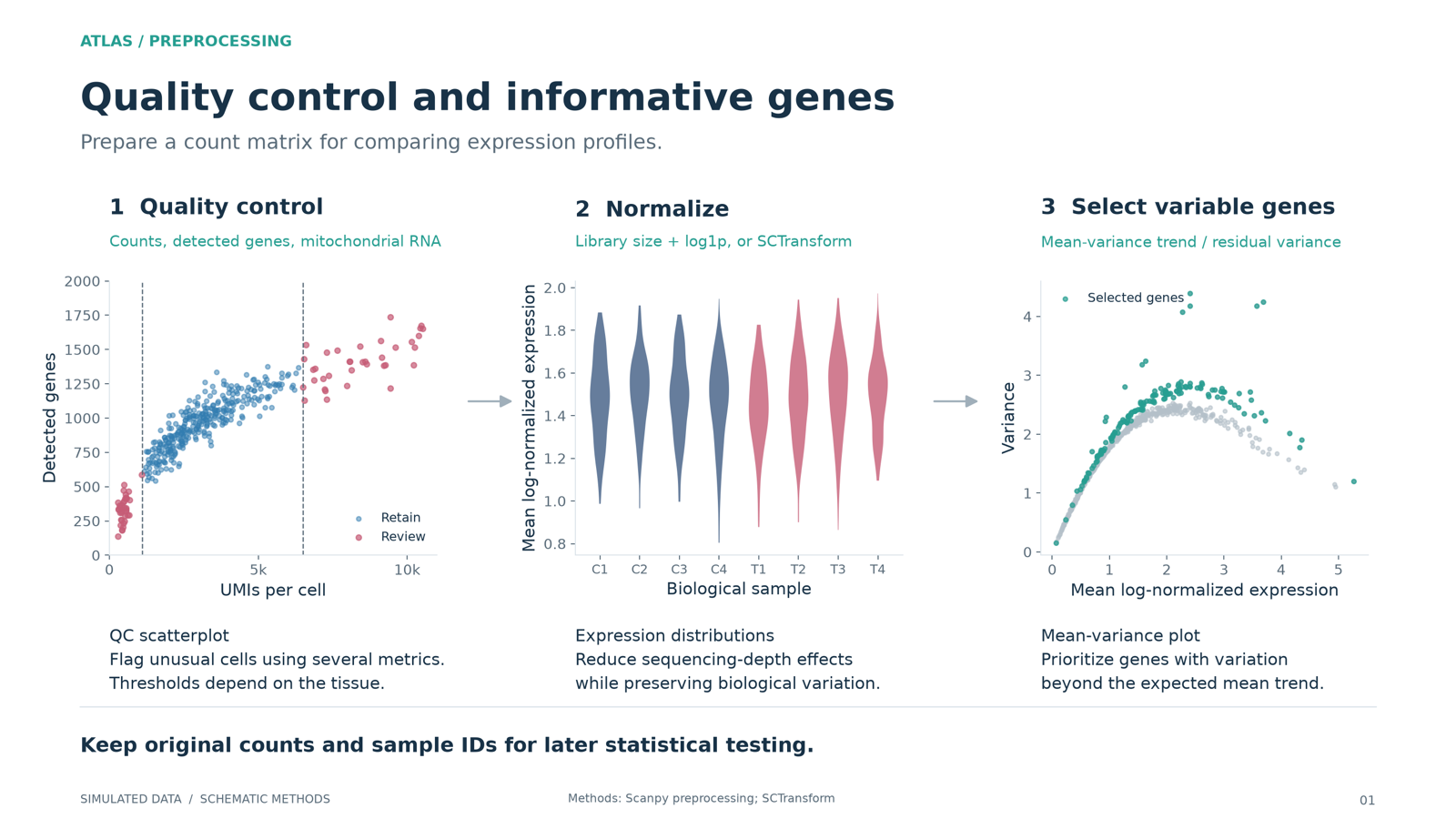
Quality control scatterplot, normalized expression distributions, and a mean-variance plot marking highly variable genes.
1. Quality control and informative genesFilter cells on QC metrics, normalize, then keep the genes that vary more than their mean predicts. SCTransform is an alternative preprocessing path, not an extra required step.
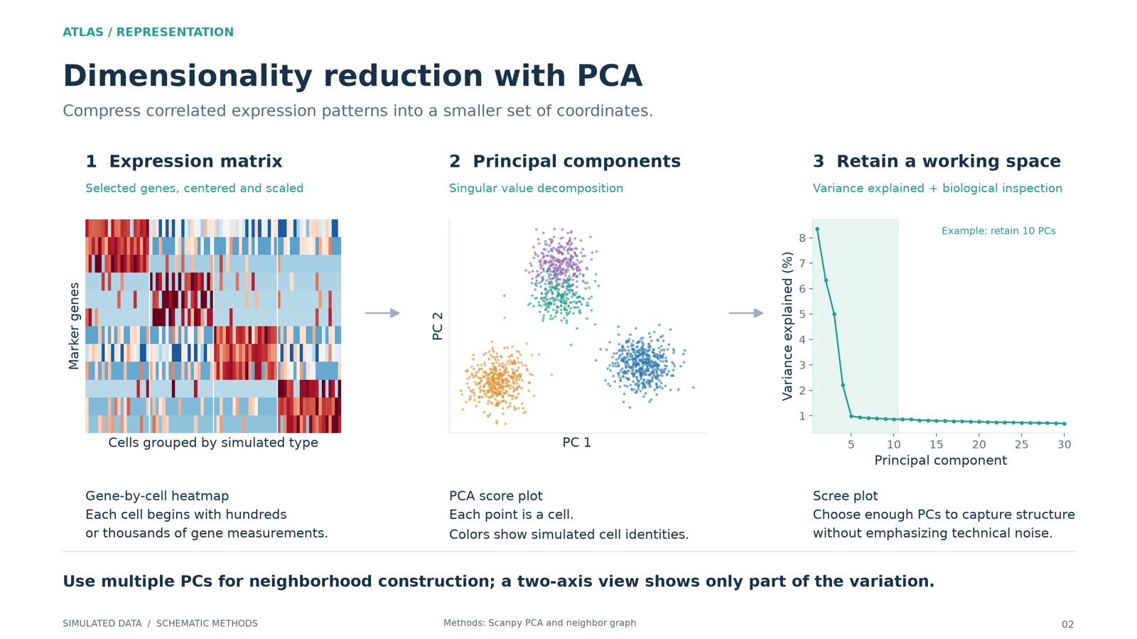
A gene by cell matrix, PCA scores of cells, and a scree plot of variance explained per component.
2. Dimensionality reduction with PCAThe gene by cell matrix is compressed to principal components. The shaded cutoff on the scree plot is illustrative, not a universal number of PCs.
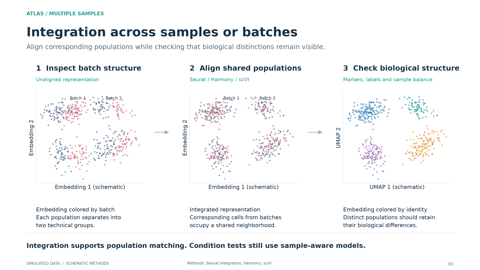
Cells colored by batch before and after integration, and the same cells colored by cell type showing identities are preserved.
3. Integration across samples or batchesIntegration should remove a batch shift without erasing real biology. Always compare the unintegrated and integrated results.
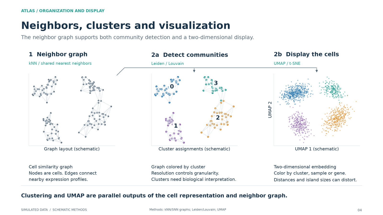
A nearest-neighbor graph of cells branching into cluster assignments and a two-dimensional UMAP-style display.
4. Neighbors, clusters and visualizationClustering runs on a neighbor graph built in many PCs, not on the two UMAP axes. The UMAP is for looking, not for clustering.
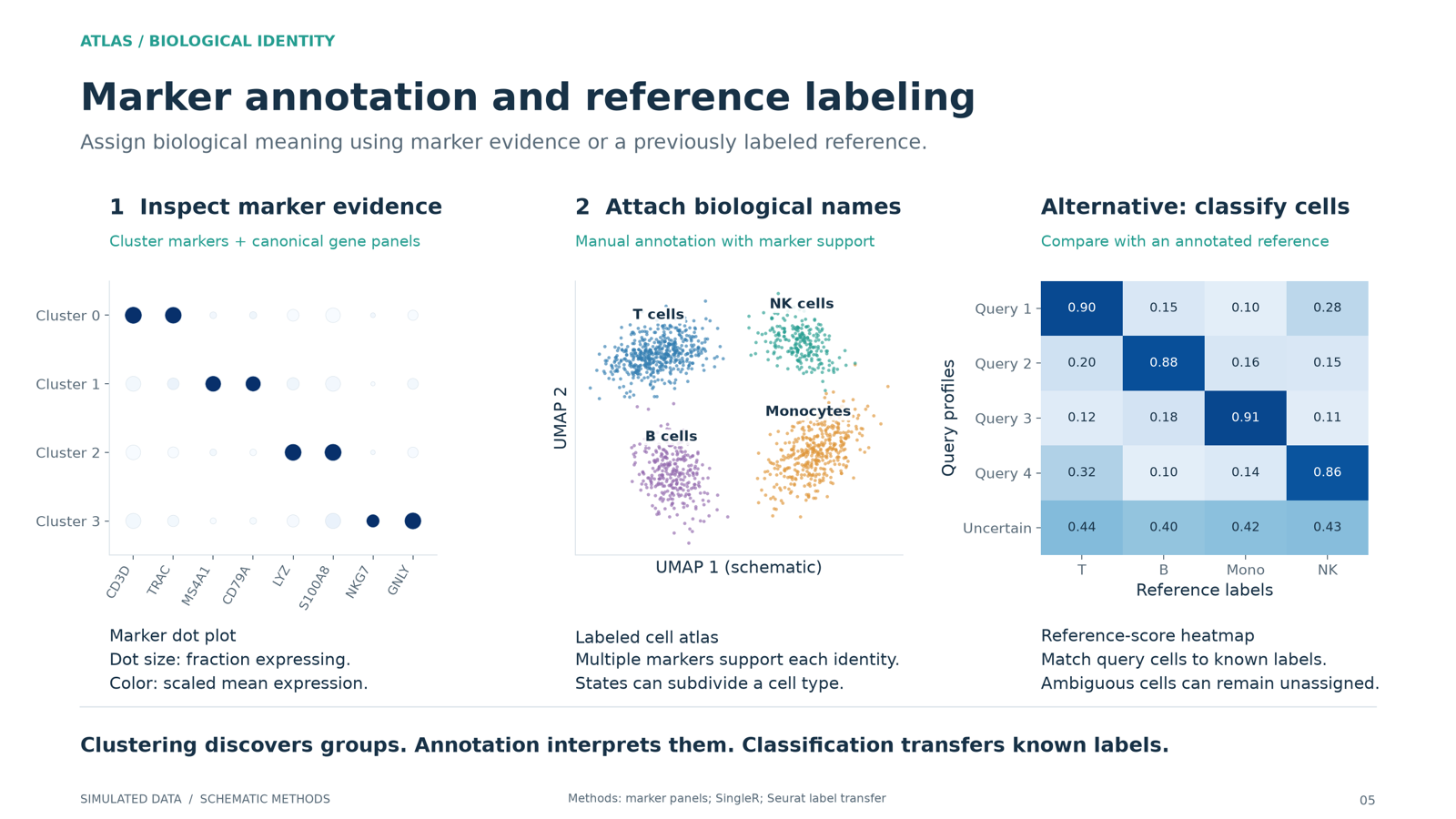
A marker gene dot plot, clusters labeled with cell type names, and a reference similarity score matrix.
5. Marker annotation and reference labelingName clusters from marker genes, or score them against a labeled reference. A reference has to cover your tissue and states; cells that fit no reference label need a closer look.
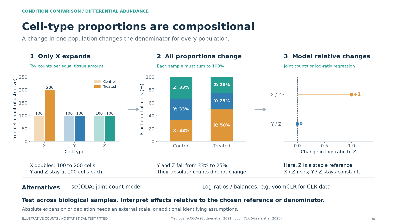
A toy example where one cell type doubles, so the fractions of the other two fall even though their counts stay the same, with a log-ratio panel.
6. Cell-type proportions are compositionalFractions share a denominator and sum to one. If X doubles while Y and Z stay put, Y and Z fall from a third to a quarter each. A lower fraction does not prove absolute depletion. Joint compositional models (scCODA), explicit log-ratios, or an absolute cell count address this, each with its own assumptions.
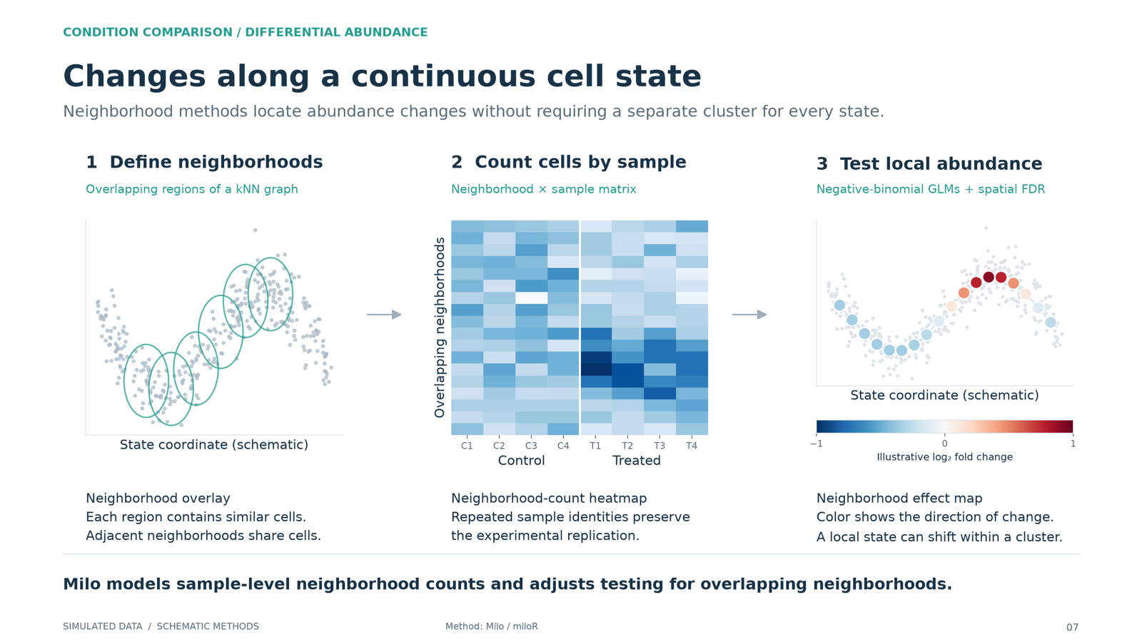
Overlapping neighborhoods along a continuous cell trajectory, sample-level neighborhood counts, and an effect map.
7. Changes along a continuous cell stateWhen cells form a continuum rather than clean clusters, test abundance in overlapping graph neighborhoods (the Milo approach) with sample-level counts.
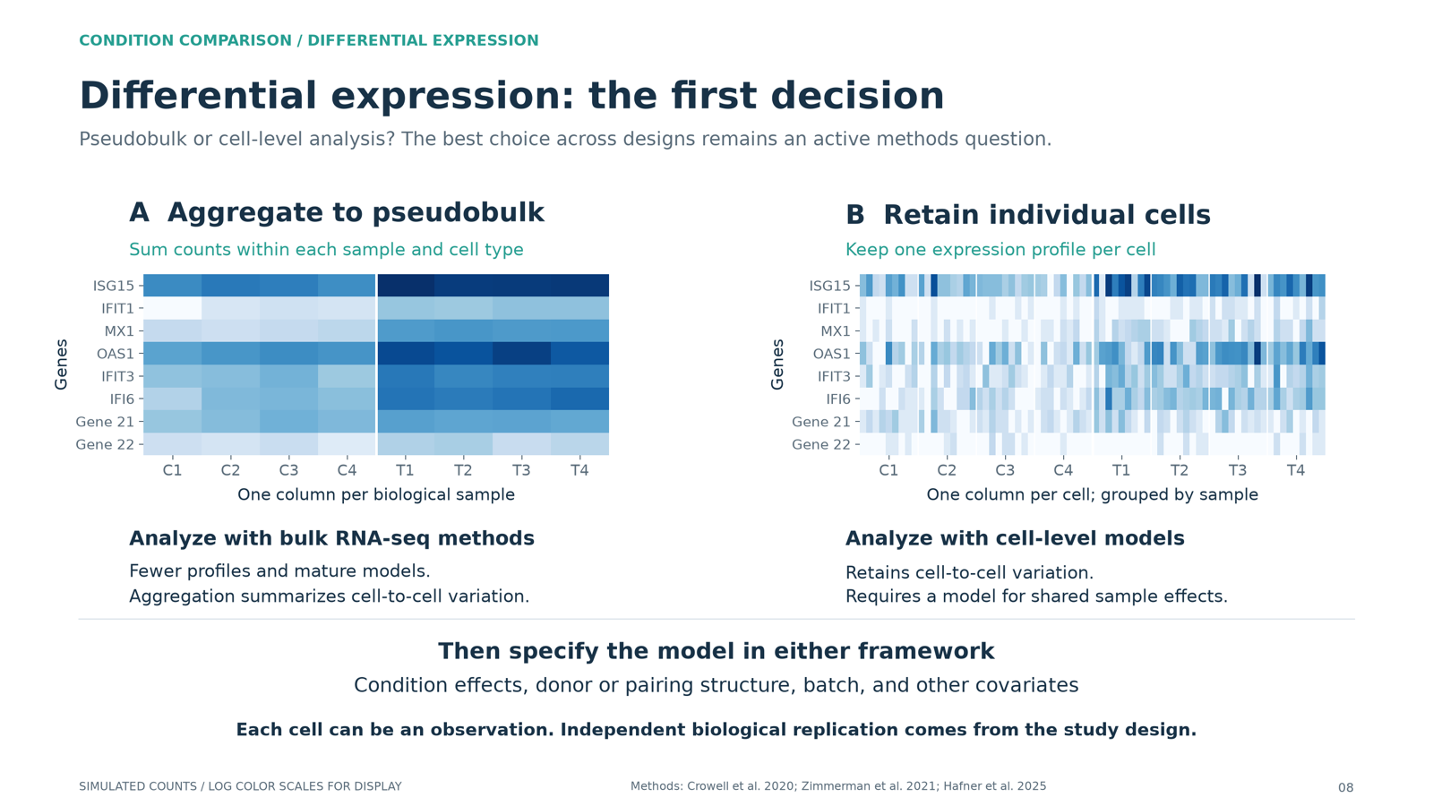
Two heatmaps of the same monocytes: a pseudobulk matrix with one column per sample, and a cell-level matrix with one column per cell grouped by sample.
8. Differential expression: the first decisionEither sum the original counts of a cell type within each biological sample and use a bulk RNA-seq tool (pseudobulk), or keep each cell as an observation in a cell-level model. Cells from one donor are not independent replicates; treating them as such is pseudoreplication.
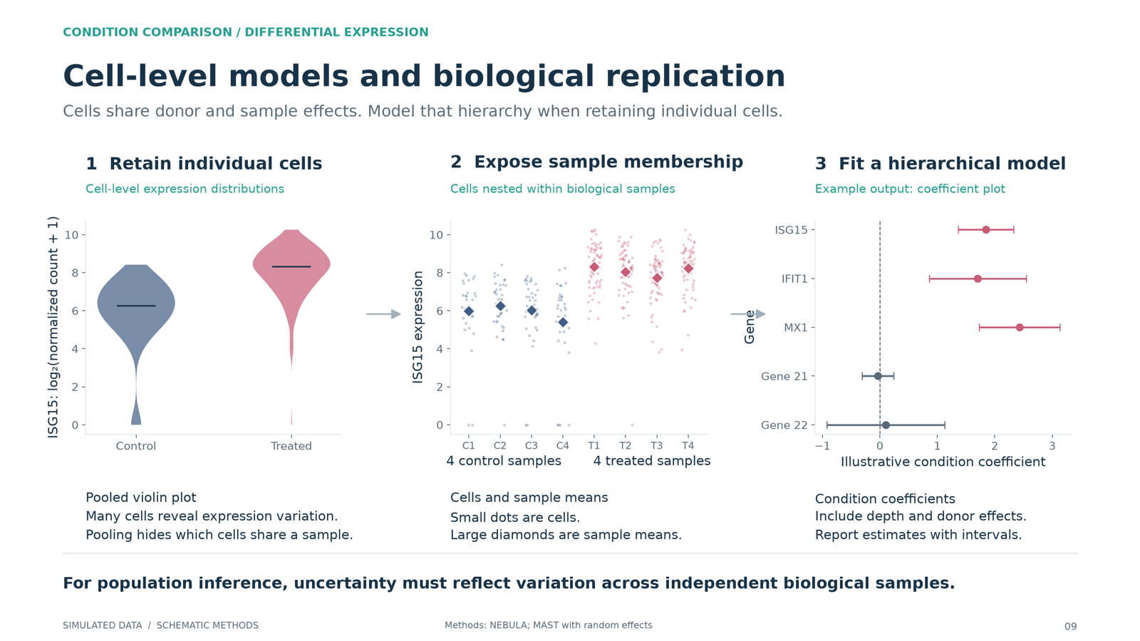
Pooled expression distributions, the same cells grouped by biological sample, and a coefficient plot with intervals.
9. Cell-level models and biological replicationA cell-level model needs a donor random effect. A donor fixed effect cannot be estimated when each donor belongs to only one condition.
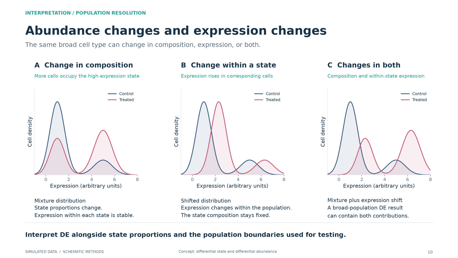
Density plots showing a change in state proportions, a shift within a state, and both together, each moving the population mean.
10. Abundance changes and expression changesA broad population’s mean can move because its substates changed proportion, because expression shifted within a state, or both. Differential abundance and differential expression are complementary views.

After the session

Two minutes of feedback, so the next session is pitched better. It also records your attendance, so fill it in whether you were in the room, on Zoom, or catching up on the recording.

Session 5 feedback